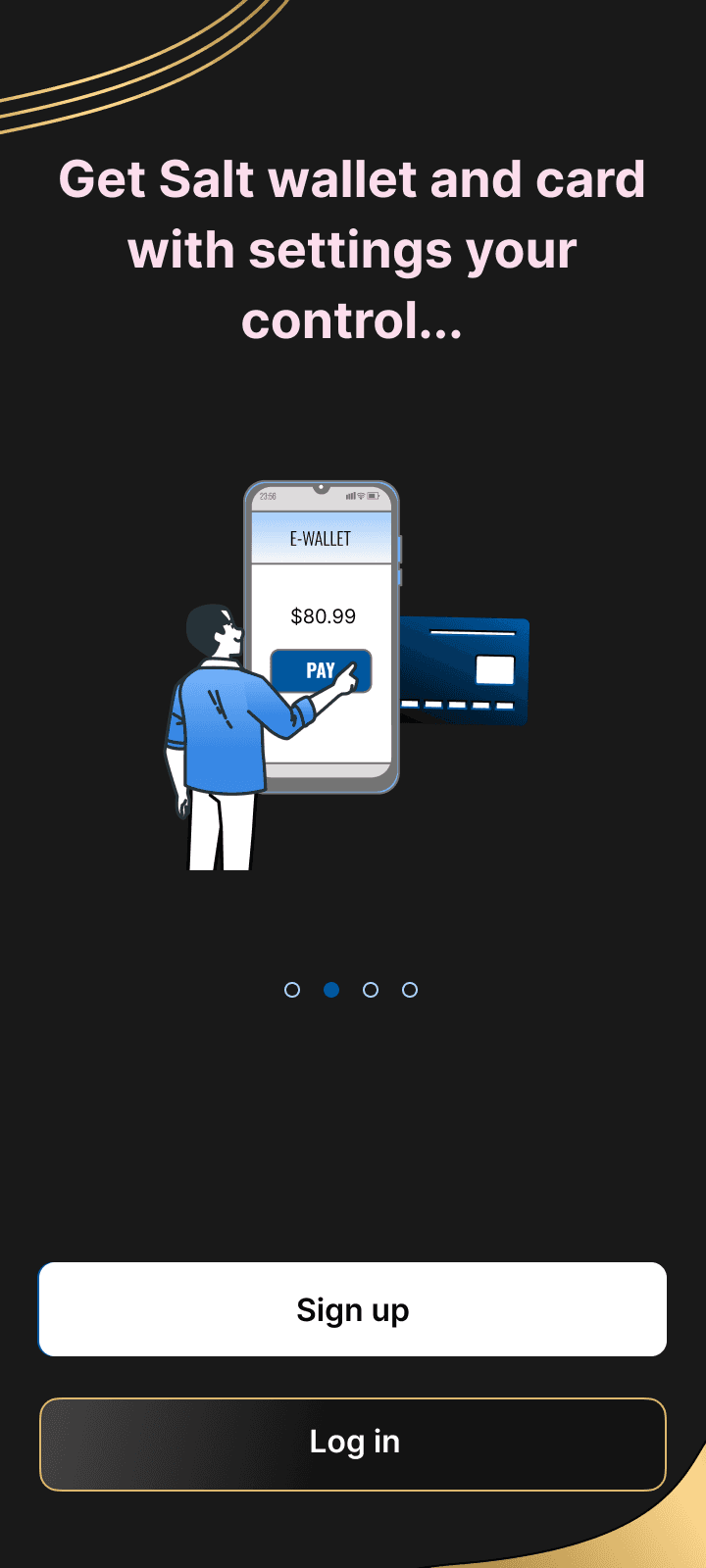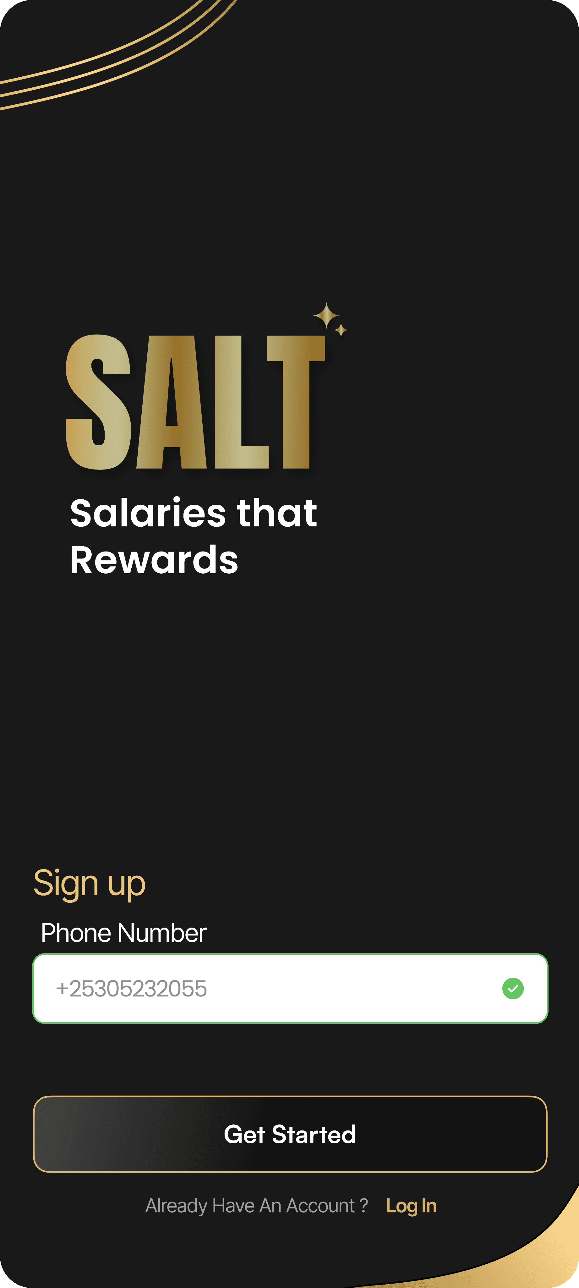

SALT
Salaries that Rewards

01
Our understanding and learnings about the product
Design & Styling
Before we start the design - The suitable styling
Context of the provided material (‘The Problem’, personas, design concept, features and approach)
Taking it ahead - How was the provided material interpreted and additional material added
02
Design Process
Empathy
Understand needs, frustrations, and motivations during flight booking and money transfers.
Define
Identified key issues like confusing navigation, lengthy booking processes, and unclear payment confirmations.
Ideate
Brainstormed solutions such as simplifying user flows, enhancing seat selection, and creating a seamless transaction experience.
Prototype
Developed interactive prototypes showcasing flight booking and money transfer, including clear visuals and intuitive navigation.
Test
Tested prototypes with users to gather feedback and refine the design for improved usability.
03
User Personas

Rohan Gupta
Biography
Age: 32 years
Occupation: IT Professional
Location: Riyadh, Saudi Arabia
Pain Point
Finds complex navigation irritating.
Doesn’t have time for lengthy booking processes.
Security concerns while transferring money.
Goal
Quickly send money to family back home in India.
Book flights and hotels for his business trips.
Manage and track balance on his ARK Card for daily expenses.
Ensure ease of use when performing transactions through a secure app.
Motivations
Convenience in managing personal finance and travel in one app.
Real-time updates and seamless user experience.
Security and reliability when booking services or sending money..
Definition & Ideation
04
Problem Definition
Users experience confusion and frustration during the flight booking process. The current app navigation is unintuitive, leading to longer booking times and increased dropout rates.
Key pain points include:
Complex navigation structures that confuse new users.
Multiple steps required to perform simple bookings.
Unclear pricing and fee structures that lead to distrust.
Difficulties in finding desired flight options due to poor filtering features.
The Solution
A redesigned flight booking app aims to streamline the process and improve user satisfaction. The updated design includes:
Simplified navigation with a more intuitive interface.
Reduction of booking steps with pre-filled user preferences.
Transparent pricing with clear breakdowns of all costs.
Improved search and filter options to quickly find suitable flights.
The solution focuses on enhancing user experience to boost confidence and satisfaction in the booking process, leading to higher conversion rates and customer loyalty.
05
Information Architecture
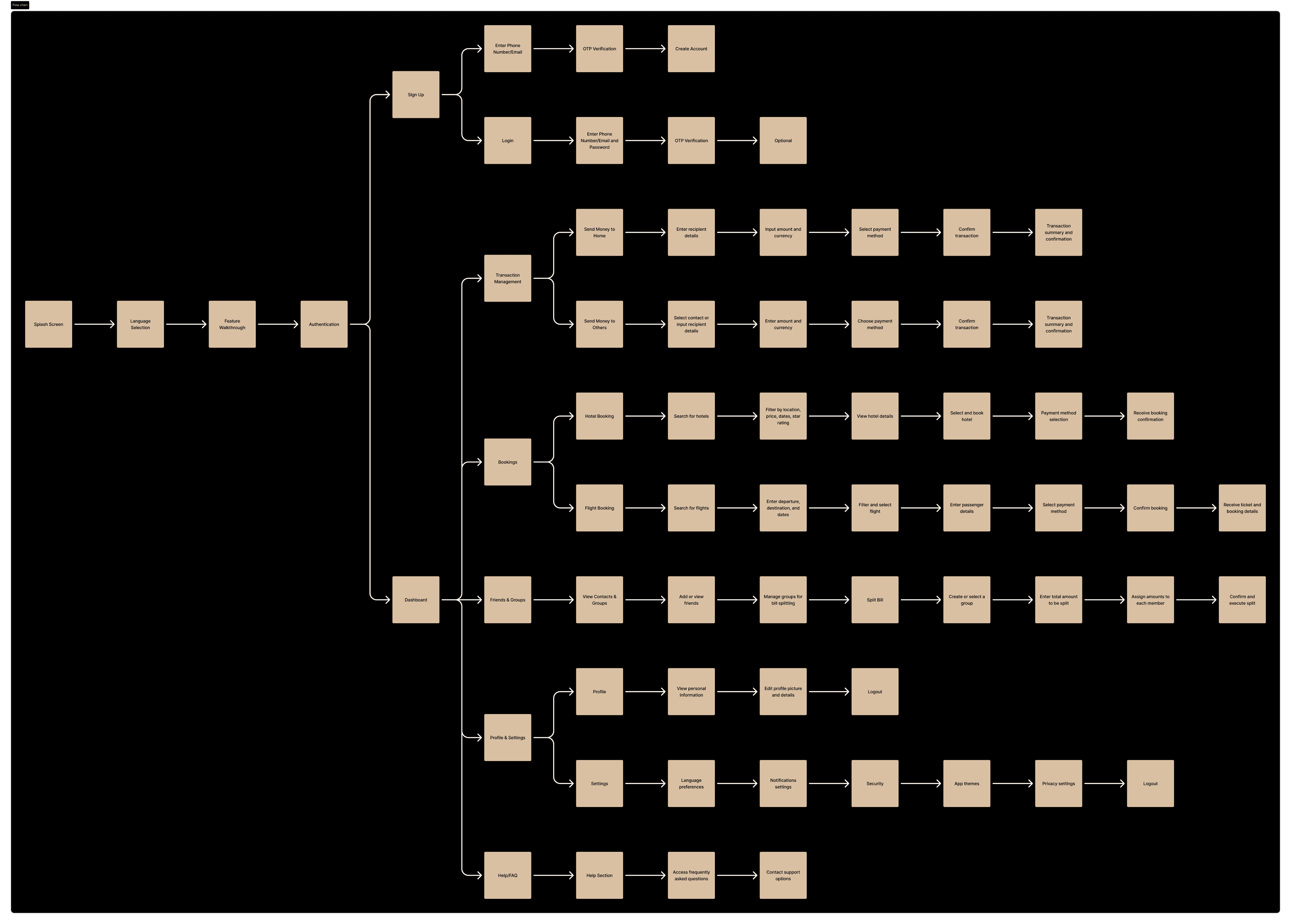
06
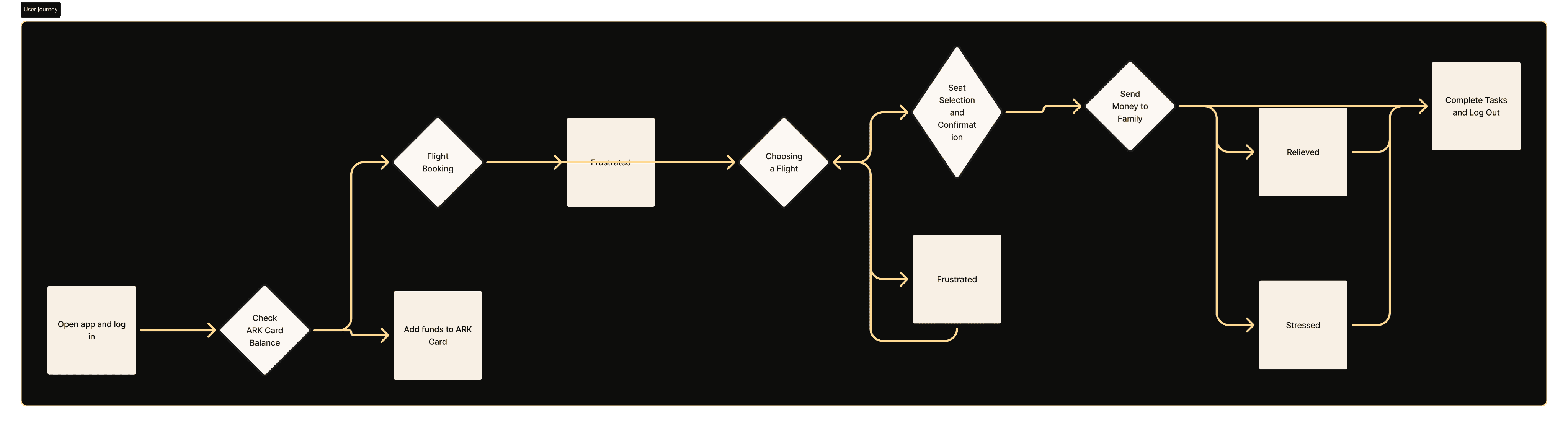
User Flow
07
Style guide
Color Palette
Your color choice decision
Hex Code
Hex Code
Hex Code
Hex Code
Typefaces
Your typefaces selection decision
Aa
ANTON REGULAR
Aa
POPPINS
08
Design

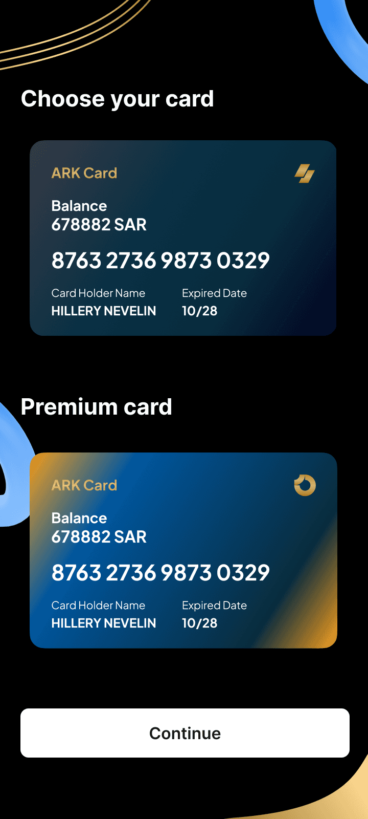
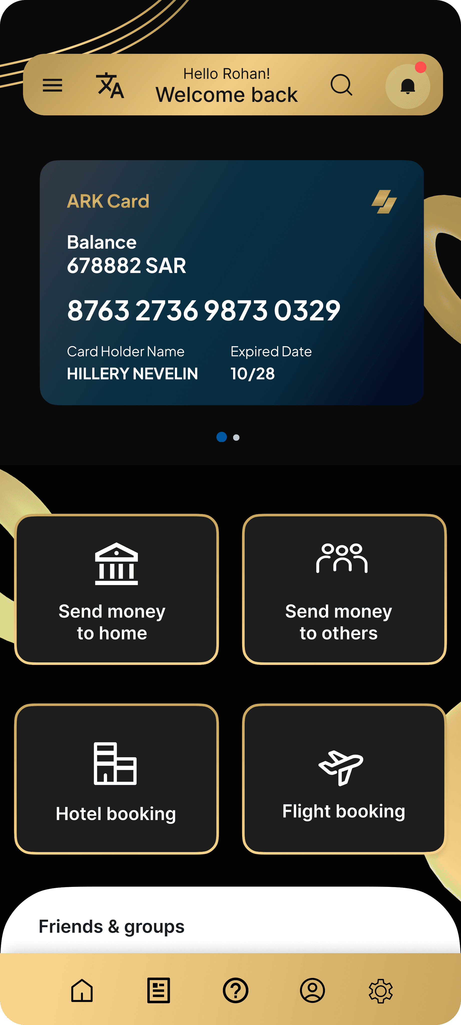
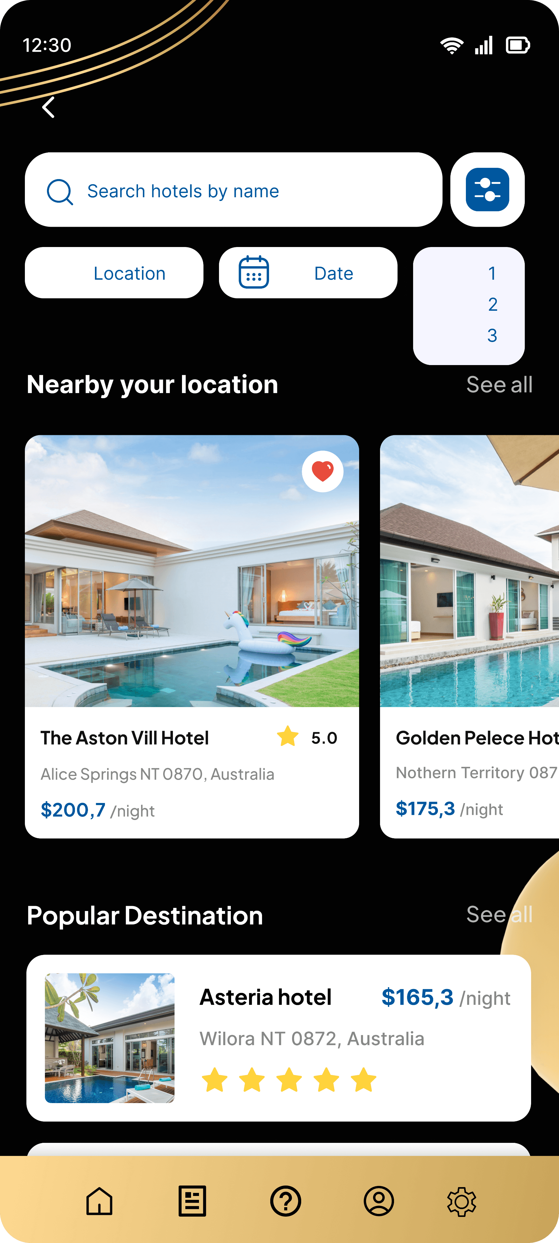
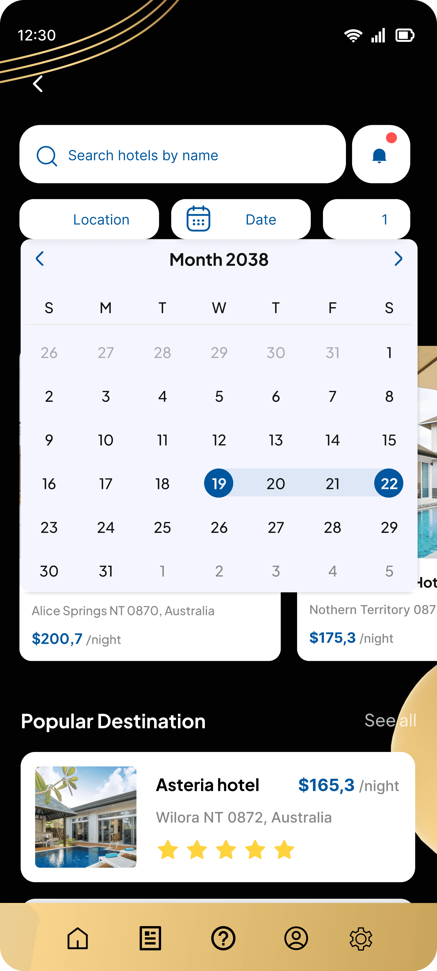
Home Screen
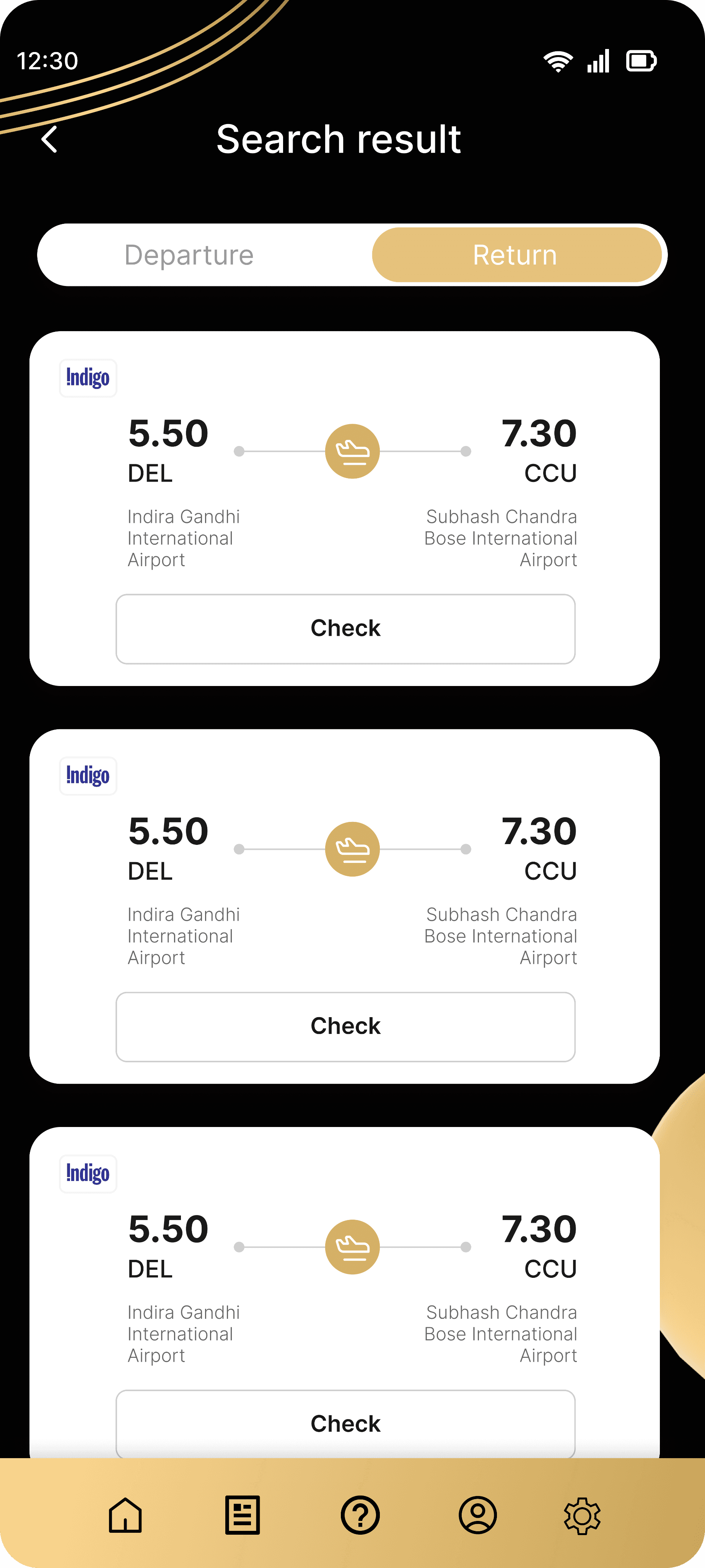
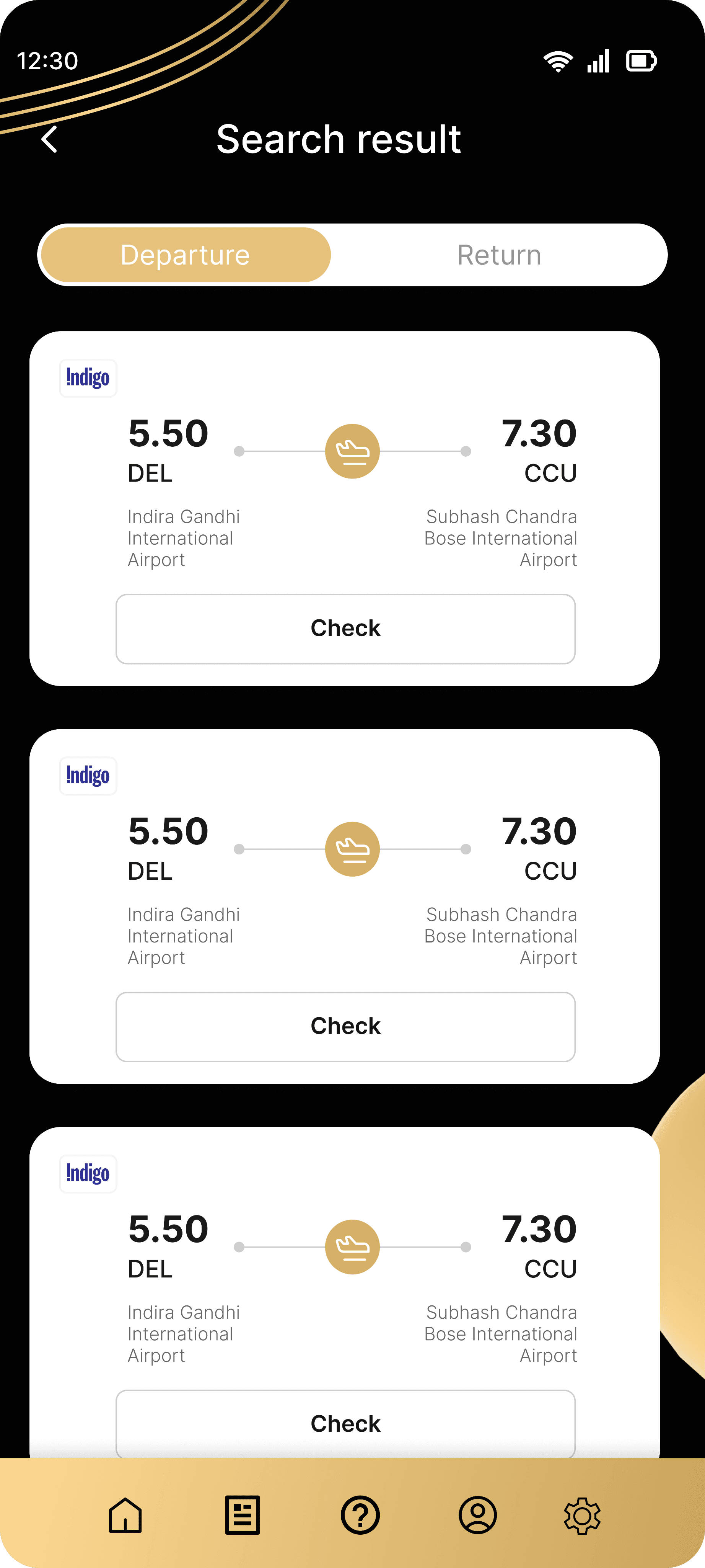
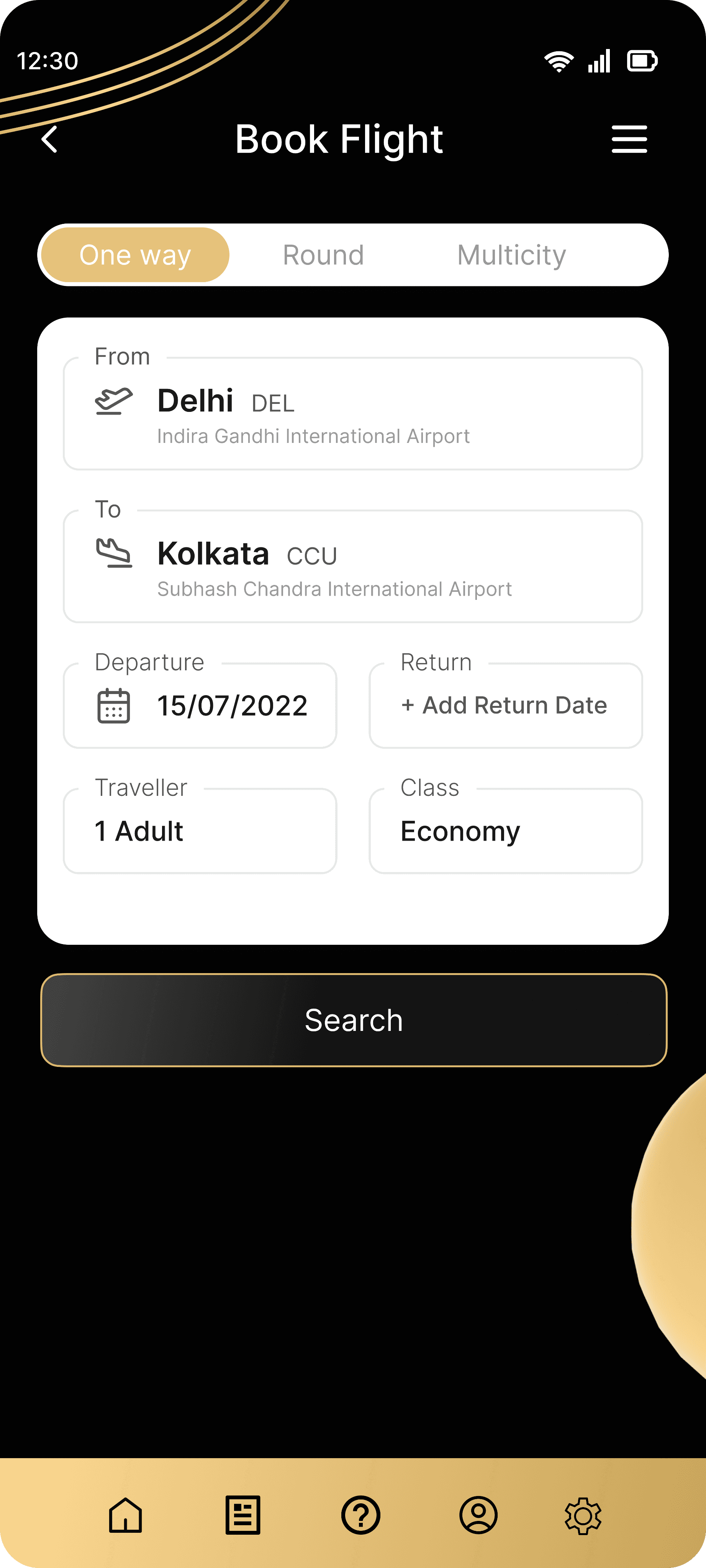
These screens represent the flight search and results process. The first screen allows users to enter flight details, including departure and destination cities, travel dates, passenger count, and class. After filling in the information, they can initiate the search. The second screen shows the search results with flight options, including times and prices, where users can check availability and proceed to book. Both screens offer a smooth and organized interface for booking flights.
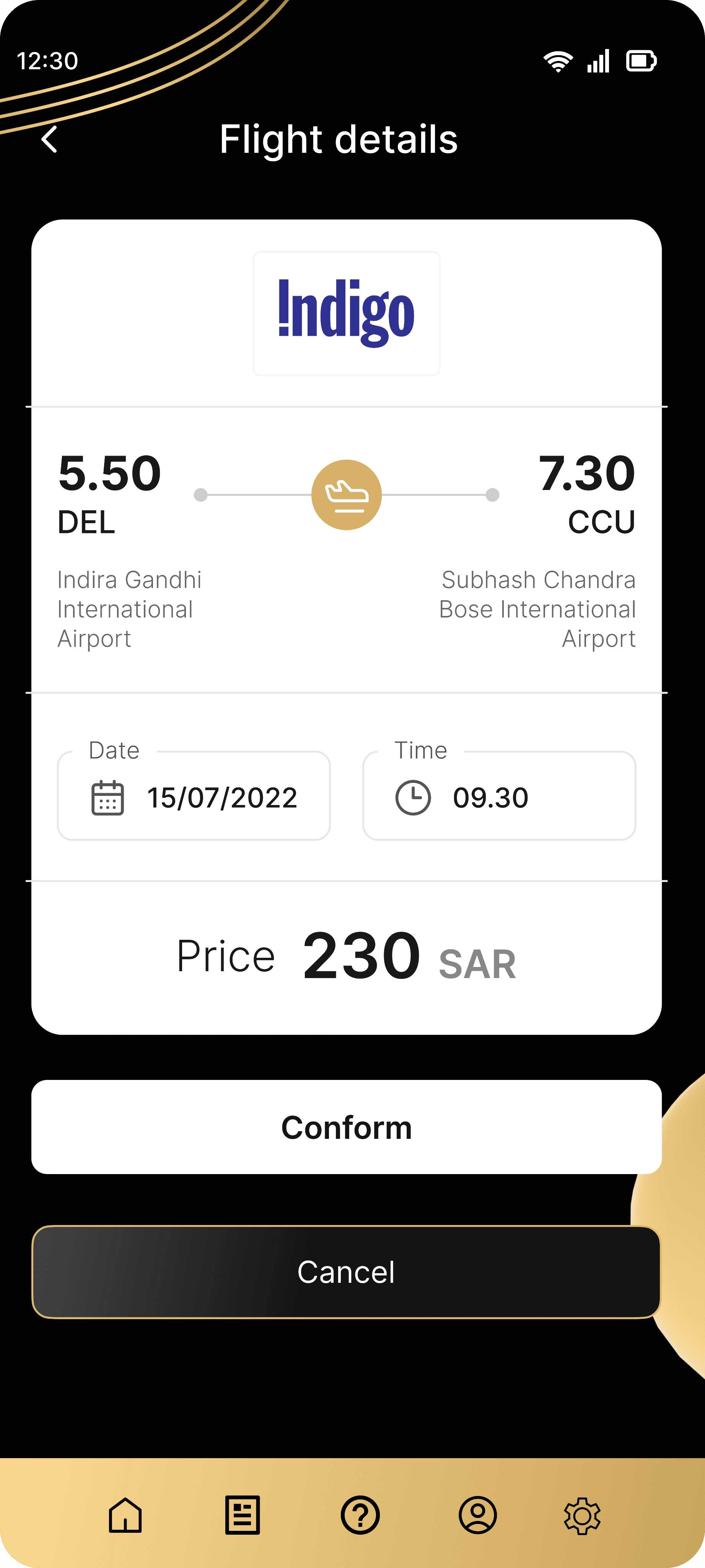
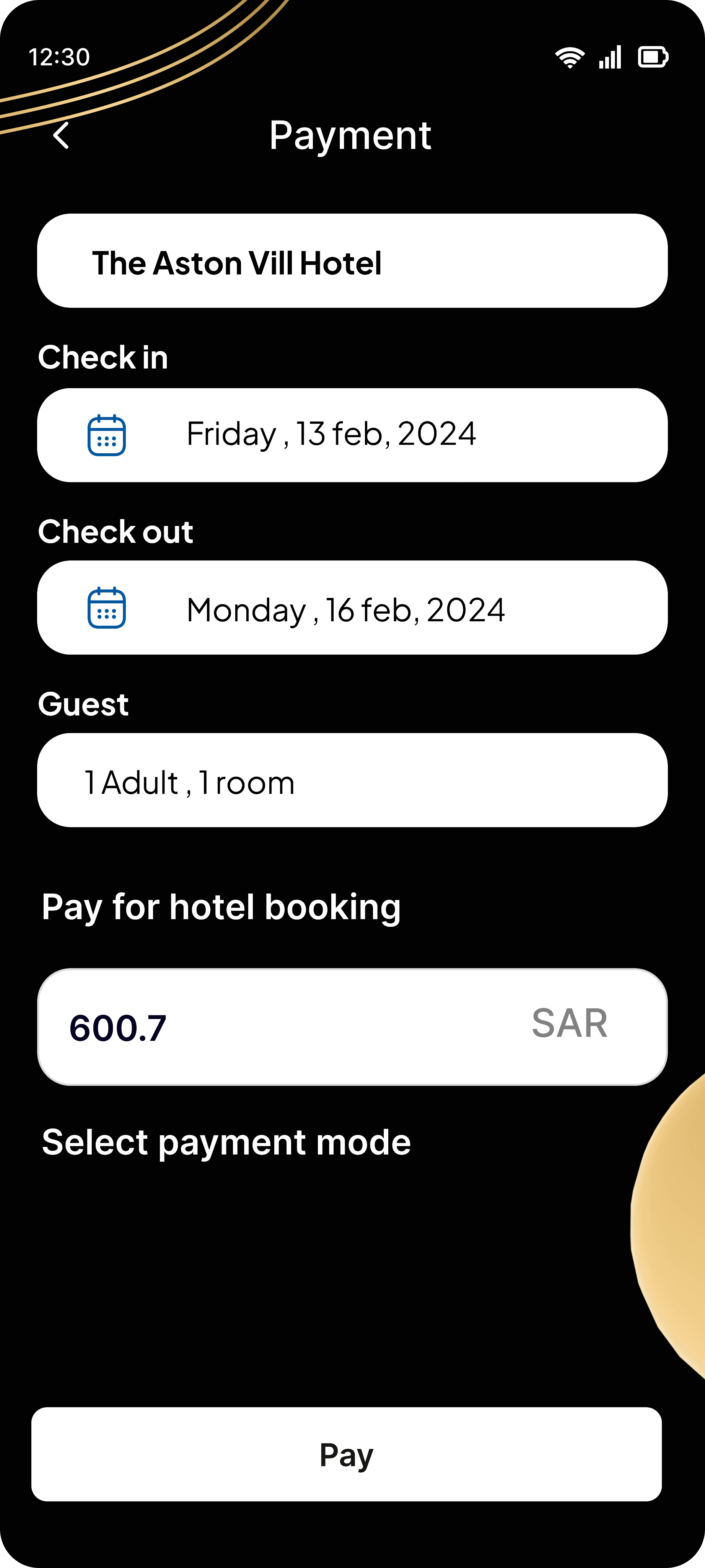
One More Screen
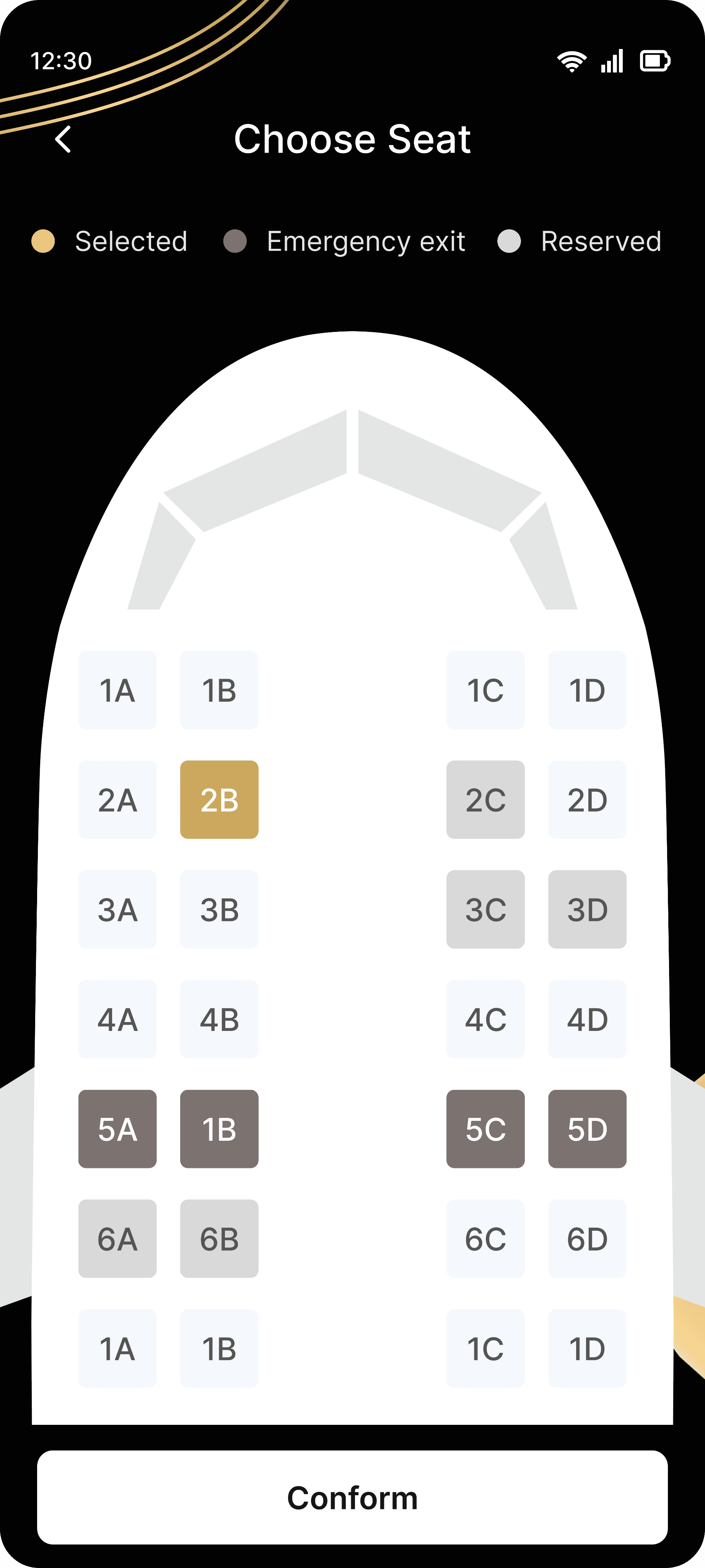
These two screens are part of the flight booking process. The first screen shows flight details such as the airline, departure/arrival times, and price. Users can confirm or cancel the booking. The second screen allows seat selection, with available seats displayed in a color-coded layout for easy interaction and final confirmation of the choice. Both screens provide a clean, user-friendly interface for seamless booking.